Know your chances
The National Cancer Institute of the US has developed a website of interactive risk charts to put cancer in context.
It's difficult to read a newspaper or magazine, watch television, or surf the Internet without hearing about cancer. Unfortunately, these messages are often missing basic facts needed for people to understand their chance of cancer: the magnitude of the chance and how it compares with the chance of other diseases.
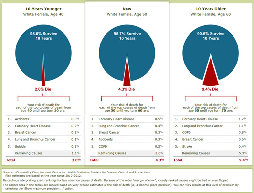
Risk charts present these basic facts by showing the chance of dying from a variety of cancer and other diseases over specific time frames. Because age, sex and race are so important in determining your chances, the charts let you account for these factors. While other factors make an important difference (like smoking or having a serious disease run in your family), the numbers from the charts will get you into the right ballpark.
In the image below we have chosen a female age 50 years to view risk.
Go to http://knowyourchances.cancer.gov/your_chances.php to view your own age.

Content updated 13 January 2016
